As I’ve been playing Role Playing Games for a while now, I’ve started to build up a collection of minis that I’ve used through various campaigns. Since I’ve spent the time to make them and paint them and invested them with the time and fun from playing various campaigns with them, it would be nice to display them. But, I’ve never quite figured out how I wanted to do that. So, as a result, my “RPG Mini Cubby” looked like this:
Not that bad, but nothing very exciting. I thought about building some shelves from wood, but I couldn’t come up with anything that I really liked. I looked around the internet for a few ideas and there are some fun solutions. I liked this one from Game Terrain Engineering. And that got me thinking about adapting my idea for four stepped shelves from wood and doing it a different way.
After a bit of measuring and sketching to make sure I understood the space I was working with, I launched in to making the basic shelves from foam-core board and hot glue. This was mostly to shake out the dimensions and get me rolling.
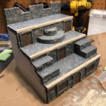
Then I started thinking about how I wanted to make it more interesting and thought that a castle seemed fitting for most of my minis. The next think I started thinking about was how the minis could move from one level to another. That’s when I started sketching out doors, windows and a couple stair variations. After another evening of noodling and cutting and building with my XPS (eXpanded PolyStyrene) foam board and some more foam core, I had those structures sketched out.
One point worth noting, a very common thing that’s pointed by people smarter than me when creating things like this is the value of asymmetry. In this video by Adam Savage of MythBusters fame, he talks about building something from scratch and the importance of everything not being bi-laterally symmetric. And I get it. I agree. There are, of course, counter-examples, but his point is valid. I thought about whether is made sense for this to be asymmetric and, in the end, obviously opted to make it symmetrical left to right. C’est la vie. It felt right.
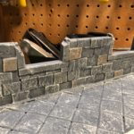
The next step for me was to build the bricks that would form that wall facings of my display. Using some ideas from Jeremy at Black Magic Craft, I built several rods representing the width and height of the bricks. Then, as I was cutting them, I varied the face depth every so often, resulting in bricks that were not the same depth which I hoped would make them more visually interesting. I also decided at this stage that the back wall had a couple windows, so I added those and the appropriate framing. I also used a rolled ball of aluminum foil to apply some texturing to all the bricked surfaces. Tedious and difficult in place, but necessary for the texturing. In the end this worked well, I thought.
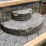
For the floors, I didn’t want to just use the same approach because it seemed like it would look boring and less interesting, so for the floors, I opted for square tiles set on a diagonal. Because imagined these as slate or the like, I decided they would be the same height, so I made a long rod of foam and then just cut many, many tiles for the flooring. All of this was secured with hot glue. I tried PVA (Elmers), but because it stayed wet for a while, tiles would shift about and that was irritating. There was also lots of custom cuts in this round to fit around the various steps.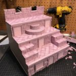
It was at this point that I reached peak “Barbie’s Dream Castle”.
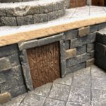
The next step involved painting the entire thing in a mix of Mod Podge and black paint to provide a base coat, but also a bit more structural integrity and toughness. Then I painted the flat colors. I used a gray for the main castle, brown for the wooden doors and a cream for the front edge of the floors. The latter really only served to separate the floors visually. I also painted some of the bricks in the walls slightly different colors because, again, it shouldn’t look all the same because nature is seldom all the same, so the stones probably wouldn’t be either. If you look closely, you’ll also note that I did some distressing of the front edges of the floors, the framing around the doors, the steps, some bricks, the frames for the back windows. All of this was to start the aging of the castle so it didn’t look like it had been built last week.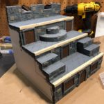
Painting the flat colors starts to get things looking better, but the next step is where things start to pop as you add some dry-brushing to start bringing out the texture and highlights. This part is fun. I’m getting better at it, I think.
The next step is sort of the contrast to the dry brushing for highlights. It involves using a wash of colored paint (usually black or black and some brown) to fill in some of the depressions and give it more definition. This dark wash is kind of the balance to the highlighting. I knocks down the brightness and represents the dirt and dust and crust that accretes with age. I even threw in some green wash to represent the moss that would build up around things over time. 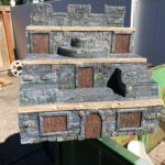


I wrapped this project with a couple of coats with a spray-on polyurethane to protect it. After letting that dry it was time to move it in and populate it. I might need to add some sort of light because the upper levels get a bit more shadowed than I’d like. Maybe something with some LEDs. We’ll see.
I’m happy with this project, in part because it’s unique and one-of-a-kind. While I stole (borrowed!) from lots of sources, it’s clearly a product of my brain and hands and I had a great deal of fun making it!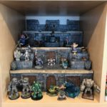



0 Comments