I made a thing this week and thought I’d go ahead and write about this one because I think it’s fairly representative of how projects happen for me these days and how I go from idea or need and iterate through to a completed project. This is what works for me or at least represents a pretty typical flow for me.
I use a standard set of chrome wire shelves in my office to store and arrange a bunch of electronics that live there. Things ranging from my PC to switches and printers and storage containers and a variety of stuff that I like to have easy access to or like to just look at.
But, one area that I’ve never given much thought to is cable and power cord management. I’m not saying this is exactly what’s going on with cable management, but let’s say it looks vaguely familiar.
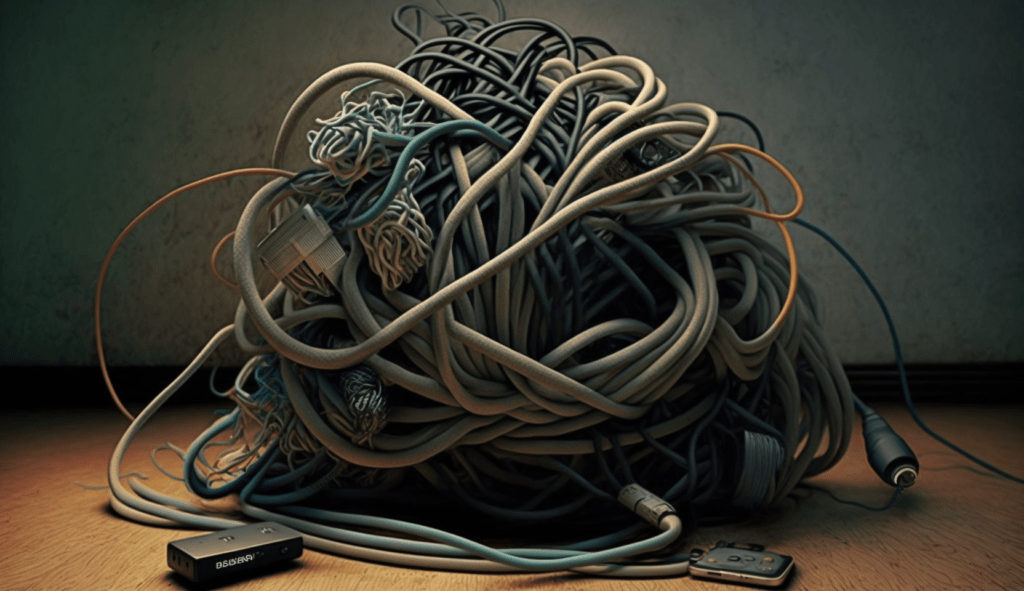
The goal, then, was to come up with a way to relocate two large power strips that the electronics use. My initial thought was to simply mount them on the back wall that the shelves are up against. But, that was going to look ugly. My next iteration was to simply mount a small sheet of plywood and mount the power strips to that. Same basic problem. Not great.
My brain often works best if I let the problem wander around for a while and see what surfaces with some time, so I did that and went about my business doing other things. One of the things that I was doing was scrolling through some social media when I ran across an image that caused me to pause. This is it, cropped:
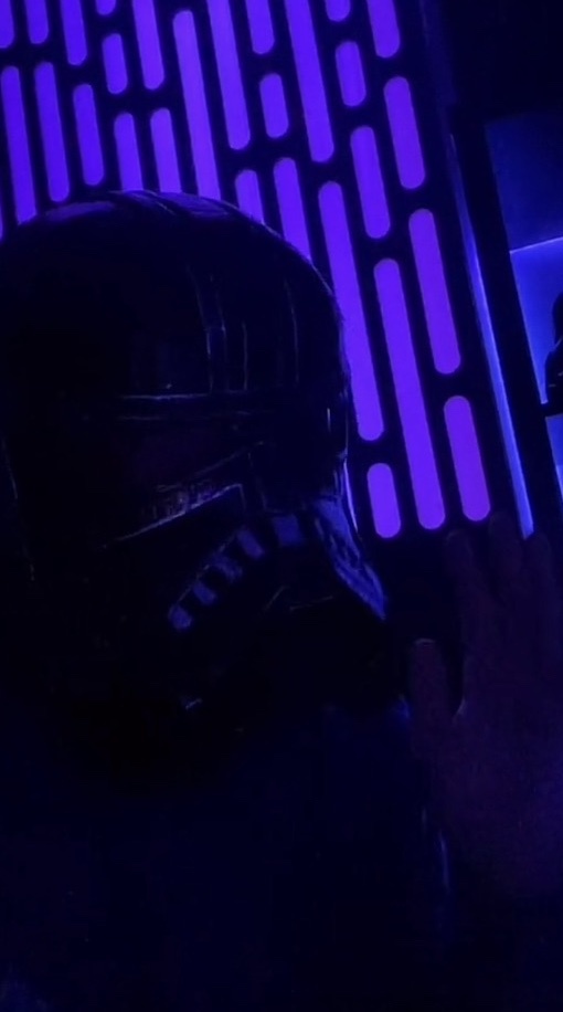
I liked the color. I liked the fact that it was a lit panel, pretty clearly LEDs, but I liked the Star Wars-like panel. I’ve no idea what makes this Star Wars, but it seems to show up fairly often around Star Wars stuff. But, it was at least eye-catching. I took a screenshot and moved on. My brain, though, started turning on this a bit.
What if, my brain offered, what if we made something like this to mount the power strips on, but rather than mount them to the wall, we could mount it to the back of the shelves so there was room for the light and we could have a kind of cool light feature behind the otherwise fairly utilitarian board that I would mount the strips on? That was starting to sound kind of cool!
Now that I had an idea that felt cool, I started noodling on some sketches. If it looks like this is going to become something I’m going to work on, I like to try and capture the plan in a journal appropriately titled “Half-Assed Ideas”. It’s filled with grid points, which make it perfect for sketching and doodling or capturing ideas and working out sizes and features.
Before I jumped into the implementation, my entries for this looked like this:


I try to capture materials, tools needed, processes like design in Affinity Designer or things that need to be designed for 3d printing.
The other thing I like to do with projects like this is to try and use them to learn more about my tools and how to use them better and more effectively. In this case, it occurred to me that cutting the pattern in the screen above could certainly be done with a jigsaw, but I could also cut in on my CNC machine, which would make it much more professional looking and regular (the odds that I could cut out 33 shapes like that and not mess up some of them were very, very low).
The first step, then, was to go off to my favorite vector graphics software, Affinity Designer. This is a very reasonably priced alternative to Illustrator. Especially for someone at my skill level with design.
I laid out the size of my board and did some math and figured out that I thought 1-inch columns would look good and allow me 11 columns of cut-outs separated by 1-inch between. My pill shapes would be a 1-inch circle top and bottom joined to a 1-inch wide rectangle. I spent some time laying them out and creating random sizes which each pill shape separated by a 1-inch square for even spacing. After a while, I was happy with the layout and the proportions. This is what it looked like in Designer:
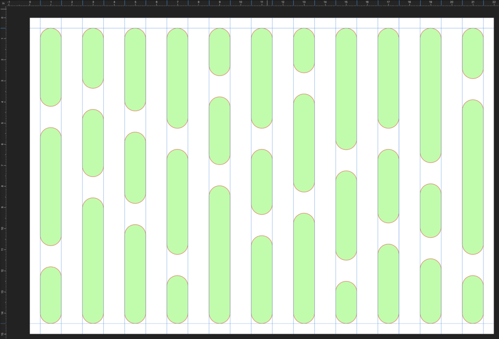
This design could be exported as an SVG file. An SVG file can be taken in to Carbide Create, the software used to create the CNC design. In that application, I tell the CNC what to do with each of those 33 pill shapes. In this case, it was basically to do what’s called a contour cut, which would cut out the pill shape, but leave a small tab holding that inner piece in place so it doesn’t fly loose. I’m not entirely sure this was necessary, but I was unwilling to risk it.
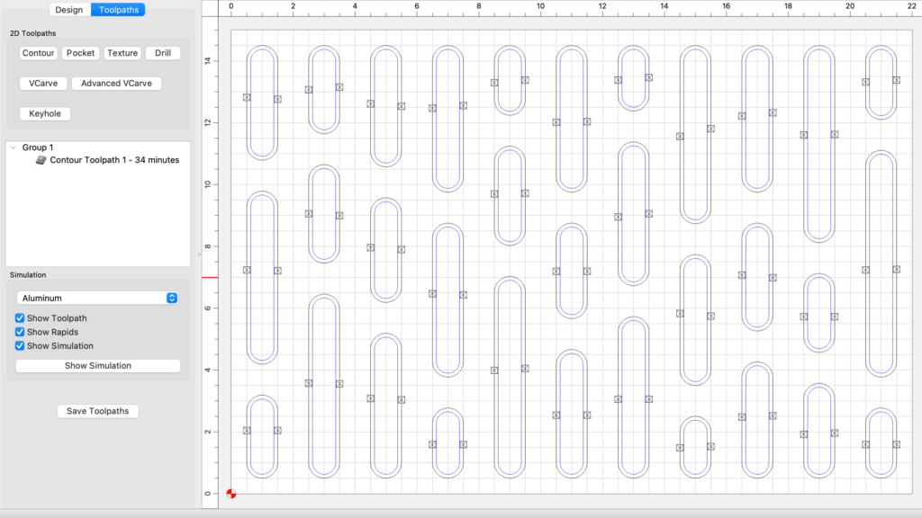
Another cool feature that gives some peace of mind is that I can run a simulation that will show me what the CNC run should do and what the results should look like after.
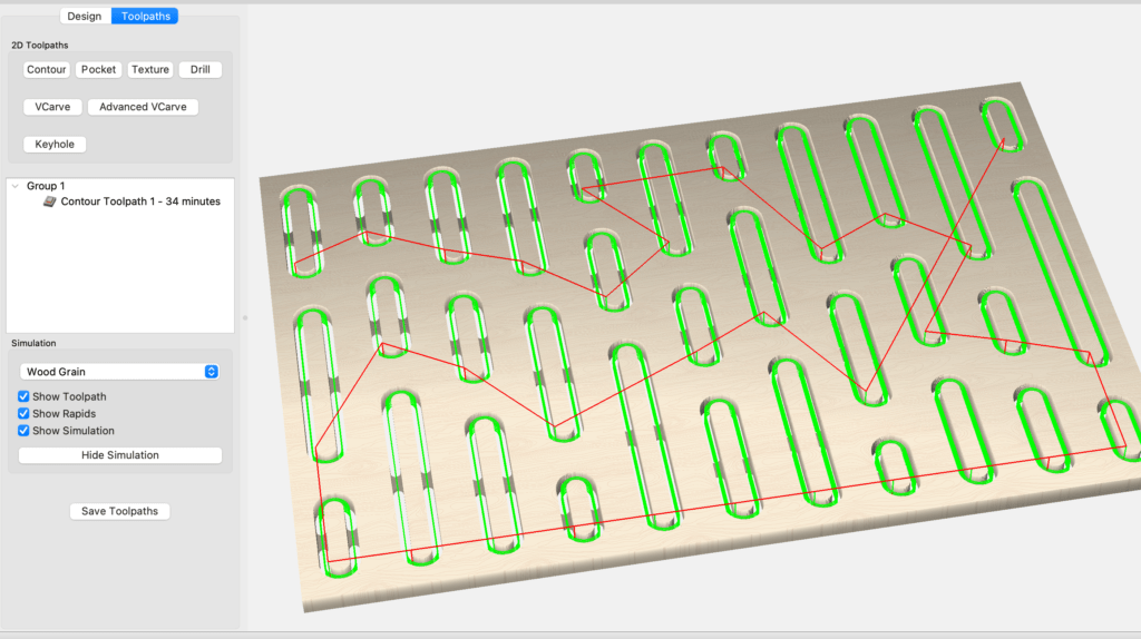
Once I set up the ½” piece of plywood that I cut to size and secured in the CNC, I ran the job and got exactly what I was looking for! After a little time removing the tabs and centers of the pill shapes, I was left with just what I was looking for as the back piece of our mount.
Next, I took some cheap pine that I had and made a basic frame for the board so it would look a bit more finished. I simply rabbeted out the back of the frame pieces and then cut them at 45 degrees to create mitered corners. Some glue and pin nails later and the frame was secured to the mounting board.
The next step was to paint a couple of coats of some gray/black paint I had which I thought would look better than leaving it as unfinished wood. The result was good, so I made a good choice.
While the paint was drying, I realized I didn’t have a way to mount the LED light strip on the back of the mount. I wanted something that would hold the light strip so the light was emitted across the back. If all I did was stick it to the back, the light would just bounce off the back wall. I decided the solution was to design and print some light support rails on the back of the mounting board that would allow me to mount the light strip so the lights were perpendicular to the back.
I designed these in Tinkercad because I do not know Fusion 360 yet, but it’s on my list. This was simple enough that I could knock it out in Tinkercad in 20 minutes or so. This is what it looked like in Tinkercad:


I had to print 10 of these, each roughly 7” or 175mm long. Those just barely fit on my 3d printer and printed overnight so they were ready to use in the morning.
Before mounting the rails, though, I needed to apply parchment paper to the back of the board to diffuse the light from the LEDs. I had some of this from a prior project, so I secured the pieces to the back, taking care to not overlap two pieces since that would change the opacity and be obvious, which meant I had to create some jigsaw puzzle pieces to make that work out, but it easy enough.
Finally, it was construction day! The paint was dry, the parts were printed, and the glue was dry!
At this point, I mounted the light rails, ten total. Then I mounted the LED light strip around the inside on the mounts, so the lights shined towards the middle of the board. I tested that the lights worked. I did notice that the adhesive on the back of the LED strip was not sticking well to the light rails, so I used some hot glue to persuade the strip to stay where I wanted it.
I added some eye screws to the back that I planned to use to secure the mounting board to the back of the shelving unit with zip ties, in case I need to remove them later.
I cleared off my shelves and began installation. This was my first pic of the result. I love it!
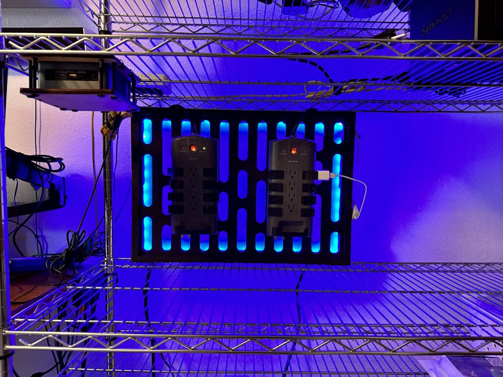
It even looked better as it got darker and the light was not so washed out as in the daytime.
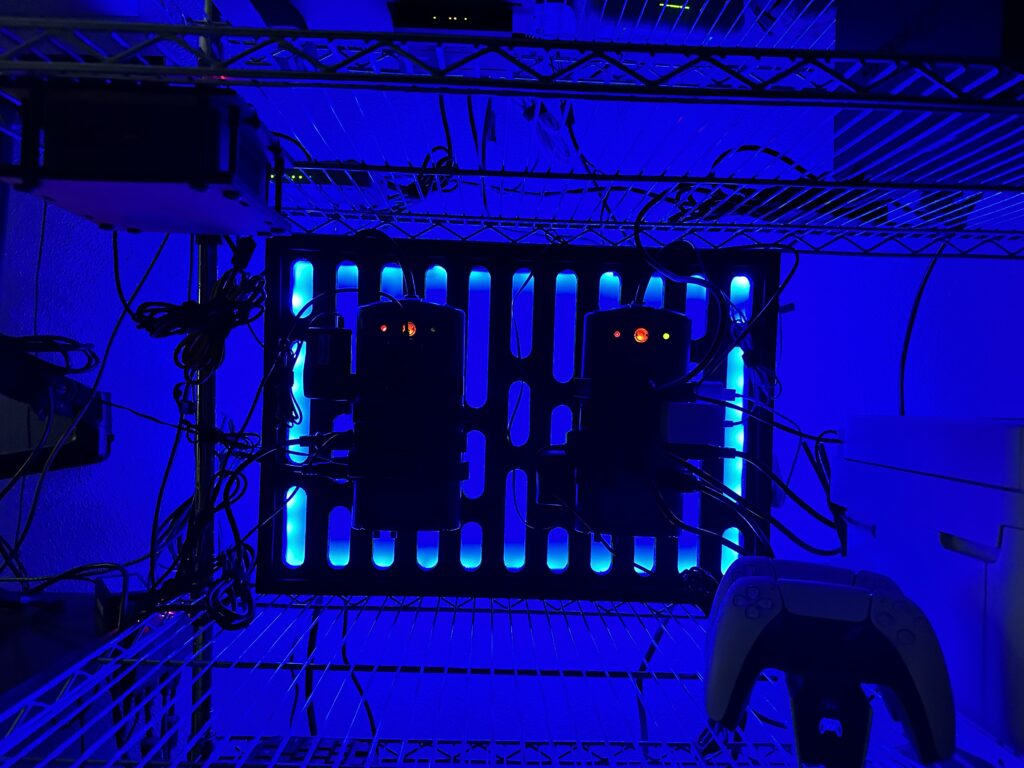
If I do a v2 of this, I’d like to try a different solution to even out the light as it’s still pretty clear the light is coming from the sides and I’d like it to look a bit more even across the board. I think the solution would be a longer light strip and light rails between each of the pill-shaped cutout columns. So, more rails and more LED lights.
But, who knows? This project turned out far better than my first cut at this, so I’m really glad I gave myself time to noodle on this and come up with a cooler idea and a design that leveraged quite a few different tools and technologies. Some of which are still new to me.
(To the cable management snobs, yes, I know this can still be done more cleanly, but please see the first image for a rough approximation of my starting point. This is better. Progress is good. “Don’t let perfect be the enemy of good (enough)”.
Thanks for coming along on the ride!



0 Comments